Glide Pricing
Glide Pricing
Designing a new page to clarify Glide’s pricing model and help customers pick the right plans.
Designing a new page to clarify Glide’s pricing model and help customers pick the right plans.
Industry
Industry
No-code software
No-code software
Role
Role
Research
Conceptualization
Design
Research
Conceptualization
Design
Timeline
Timeline
Q2 2023 - Q3 2023
Overview
Overview
Glide helps businesses build their own custom software from their data without using any code
Glide helps businesses build their own custom software from their data without using any code
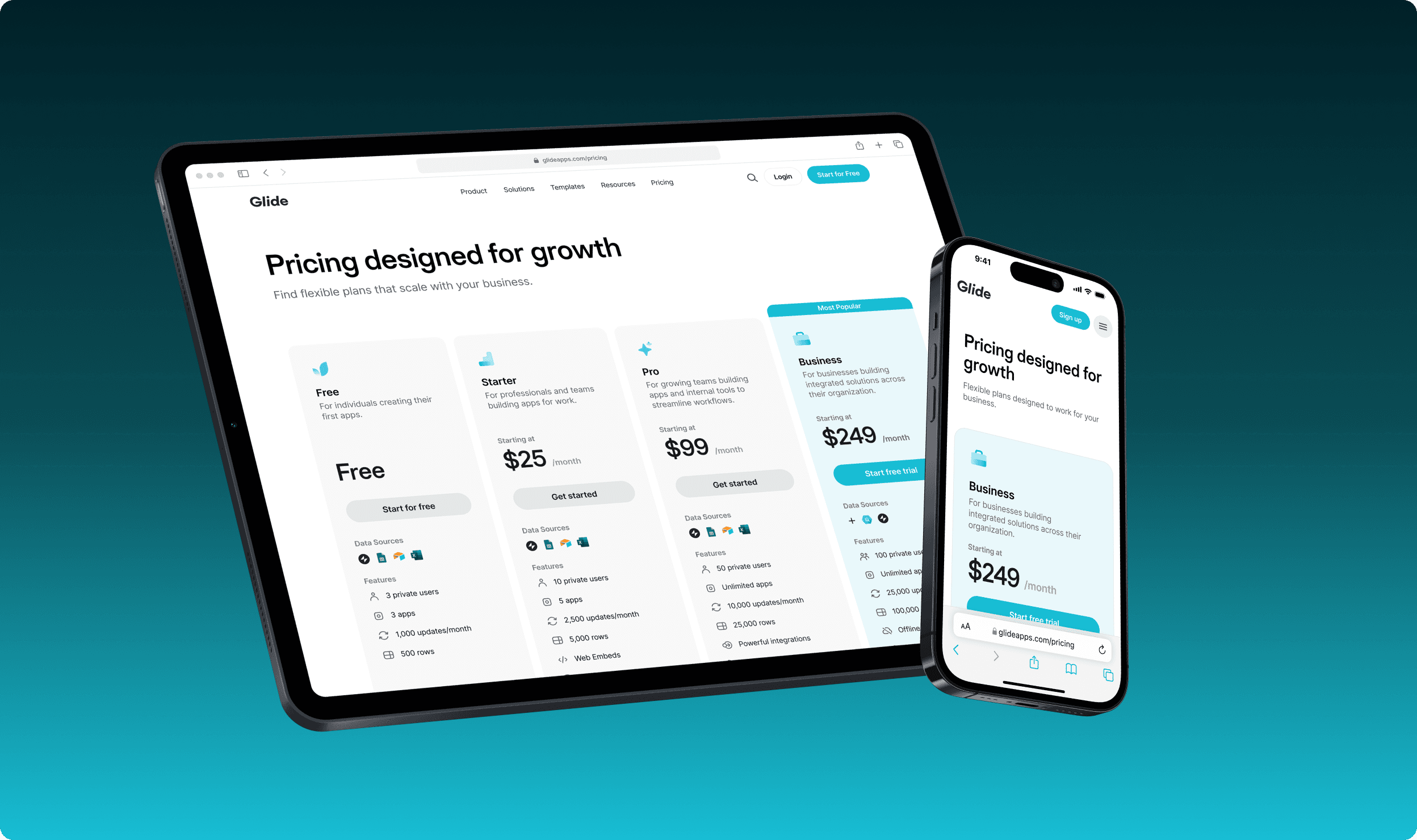
During the summer of 2023, I worked with the marketing, engineering, and sales teams at Glide to help improve the product experience and drive growth. For this project, I restructured the pricing page to more clearly communicate the benefits of each of Glide’s pricing plans. The new page was successfully deployed to the marketing site and strengthened Glide’s inbound sales pipeline by helping prospects select the plans that were right for them.
During the summer of 2023, I worked with the marketing, engineering, and sales teams at Glide to help improve the product experience and drive growth. For this project, I restructured the pricing page to more clearly communicate the benefits of each of Glide’s pricing plans. The new page was successfully deployed to the marketing site and strengthened Glide’s inbound sales pipeline by helping prospects select the plans that were right for them.
Problem breakdown
Problem breakdown
Problem breakdown
Reimagining the pricing page to help customers pick the right plans
Reimagining the pricing page to help customers pick the right plans
Previous design
Previous design


Revised design
Revised design


Problem 01
Problem 01
Problem 01
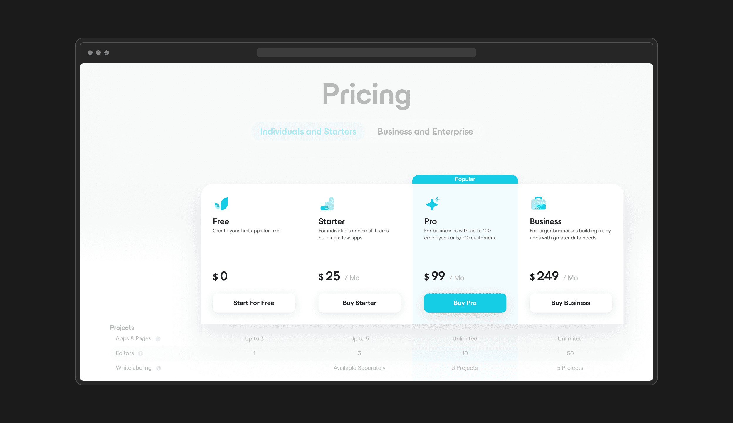
The most valuable plan, Enterprise, was hidden behind a toggle
The most valuable plan, Enterprise, was hidden behind a toggle
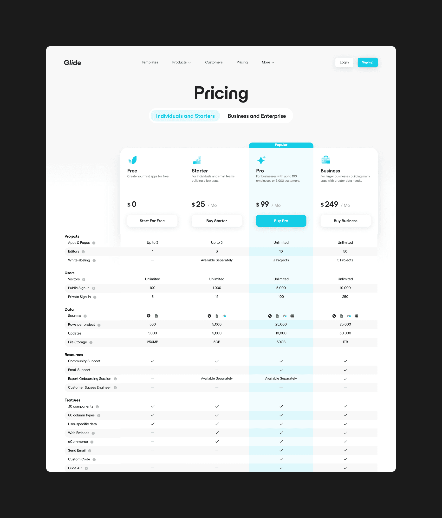
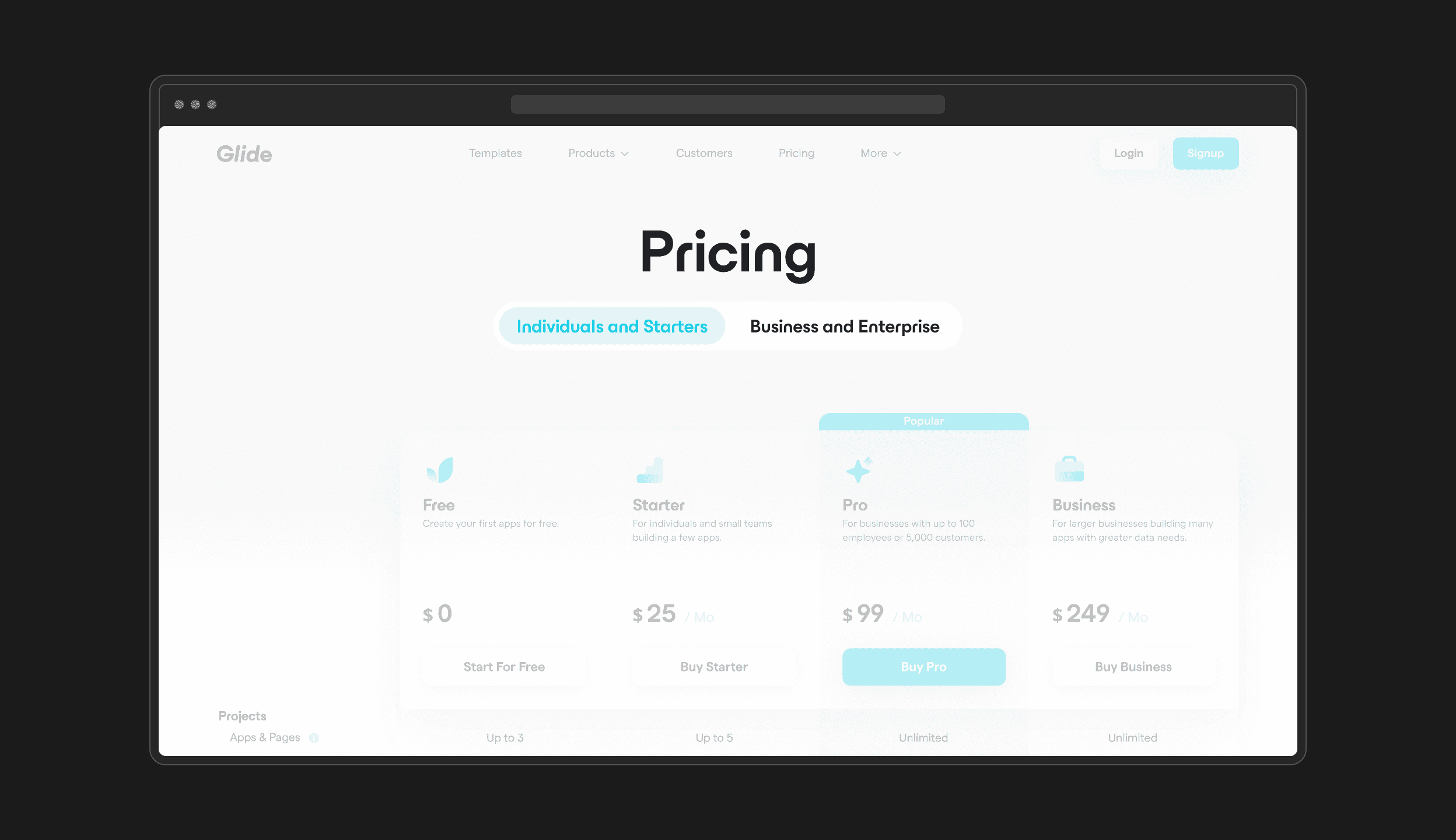
Pricing plans used to be grouped as either for individuals or for businesses, but we found that prospective customers often missed the tab switcher altogether. This meant that customers from larger companies almost always missed the Enterprise plan, which was hidden behind the business tab.
Pricing plans used to be grouped as either for individuals or for businesses, but we found that prospective customers often missed the tab switcher altogether. This meant that customers from larger companies almost always missed the Enterprise plan, which was hidden behind the business tab.


Problem 02
Problem 02
Problem 02
It was difficult to tell how the plans were different at a glance
It was difficult to tell how the plans were different at a glance
The plans only provided brief, vague descriptions of the types of customers they were geared towards and then immediately jump into a detailed comparison table.
The plans only provided brief, vague descriptions of the types of customers they were geared towards and then immediately jump into a detailed comparison table.


Problem 03
Problem 03
Problem 03
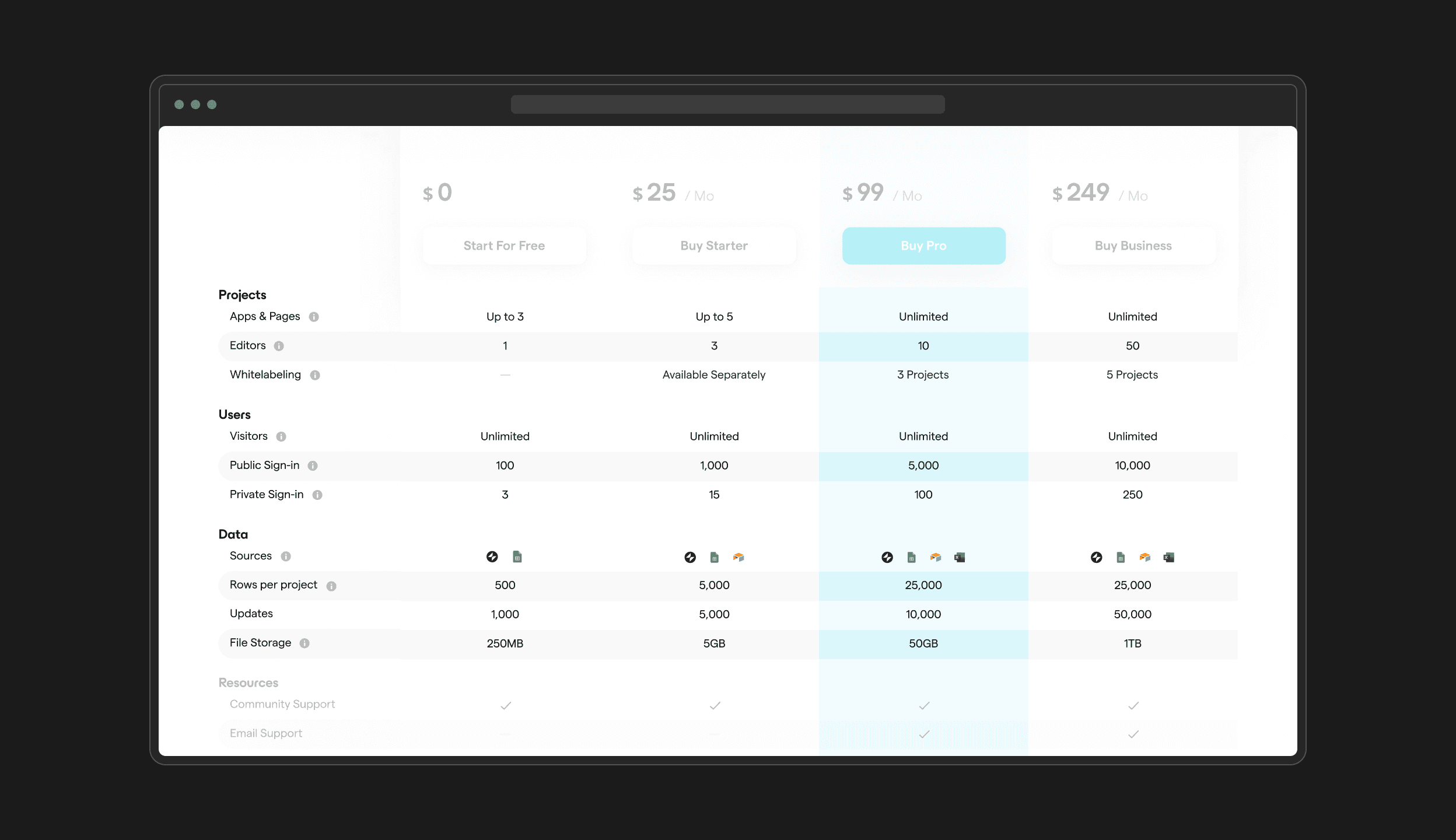
The comparison table had poor information density and did not show all the plans
The comparison table had poor information density and did not show all the plans
Even though this table was meant to help customers compare the features of all five plans at once, the Enterprise plan was still hidden on the business tab. Users were also confused about why certain rows were highlighted and others weren’t.
Even though this table was meant to help customers compare the features of all five plans at once, the Enterprise plan was still hidden on the business tab. Users were also confused about why certain rows were highlighted and others weren’t.


Separating out the plans
Separating out the plans
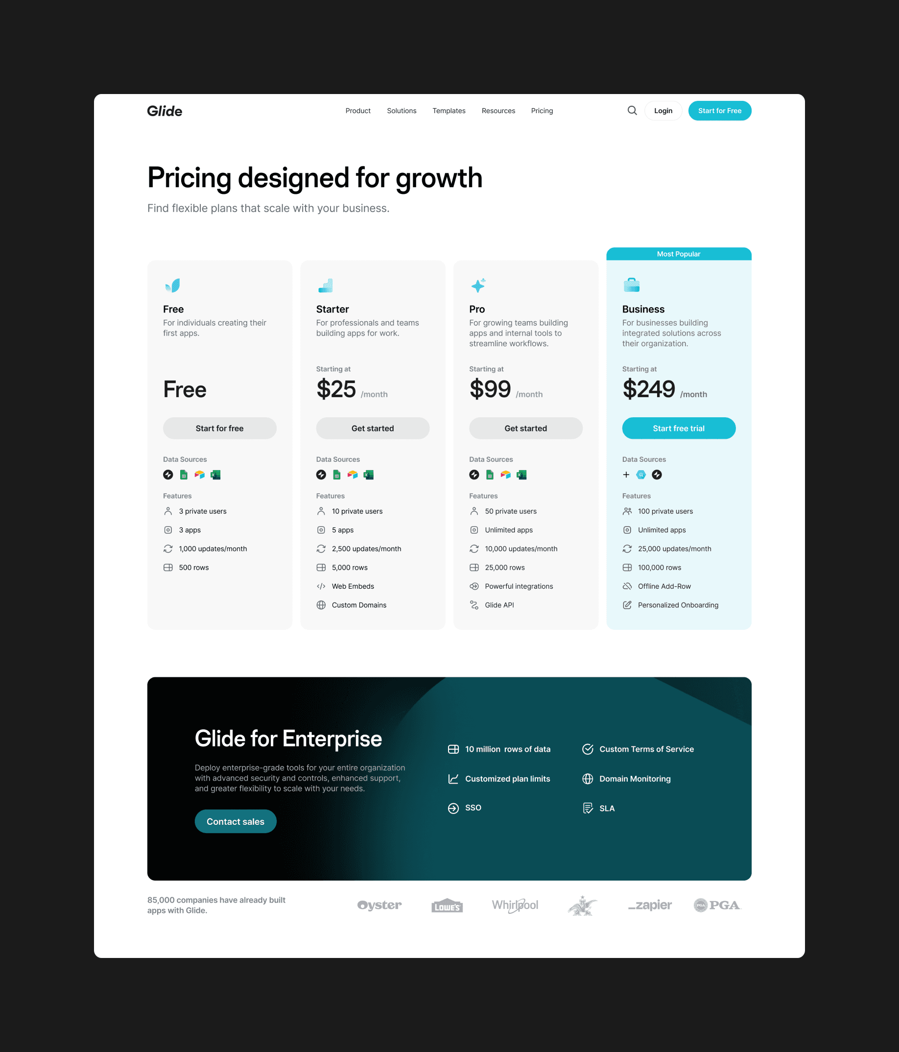
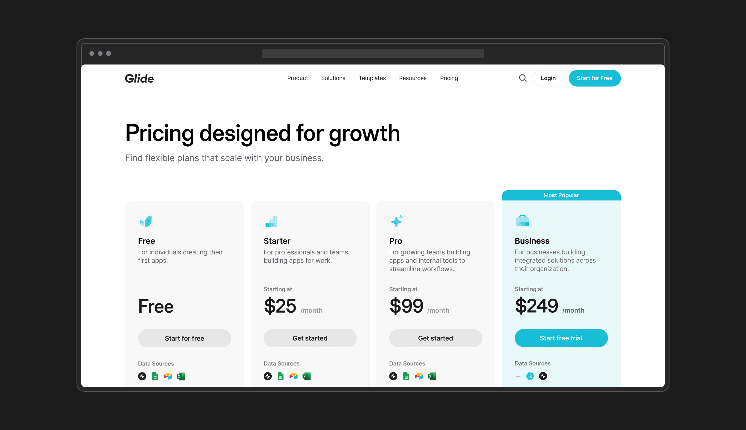
I began reimagining the page by separating each of the main plans into distinct cards and detaching them from the comparison table below. This helped to highlight the plans as the most important elements on the page.
I began reimagining the page by separating each of the main plans into distinct cards and detaching them from the comparison table below. This helped to highlight the plans as the most important elements on the page.


Key feature overview
Key feature overview
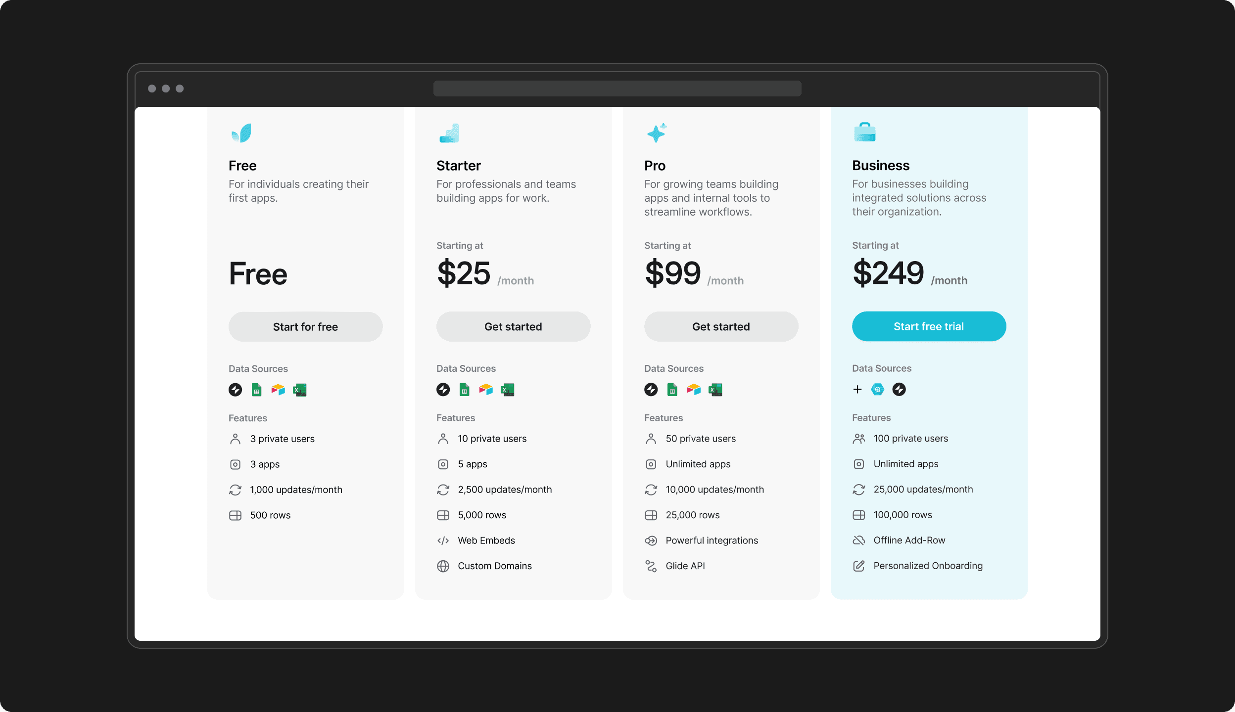
Each plan now shows its key benefits and supported data sources with simple icons. Instead of jumping to the comparison table, customers can determine if a plan is right for them at a glance.
Each plan now shows its key benefits and supported data sources with simple icons. Instead of jumping to the comparison table, customers can determine if a plan is right for them at a glance.


Bringing attention back to the Enterprise plan
Bringing attention back to the Enterprise plan
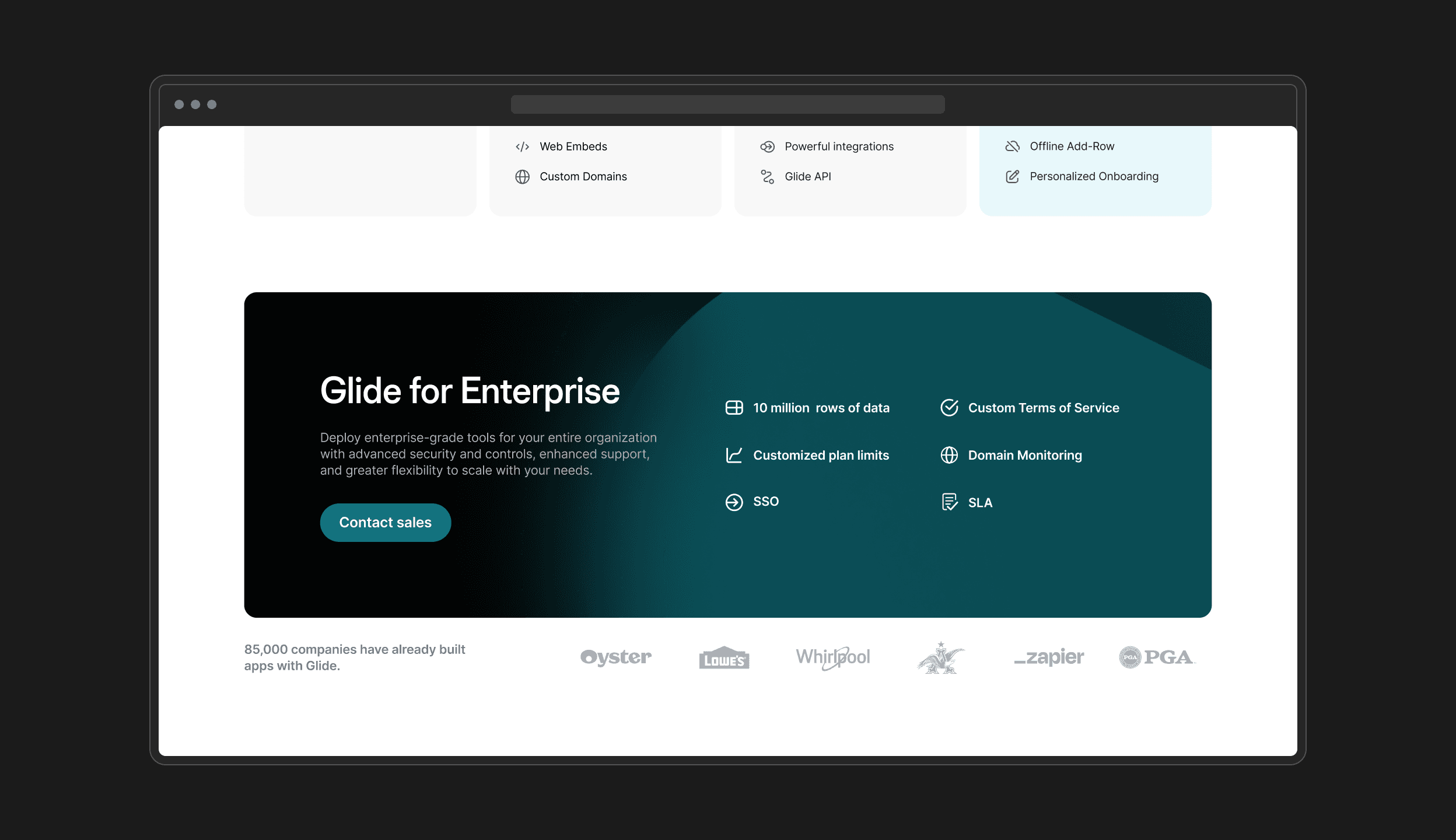
I brought the Enterprise plan front and center with a prominent dark-themed section, showcasing its exclusive features and highlighting some of the notable companies already leveraging Glide at scale.
I brought the Enterprise plan front and center with a prominent dark-themed section, showcasing its exclusive features and highlighting some of the notable companies already leveraging Glide at scale.


Streamlining plan comparison
Streamlining plan comparison
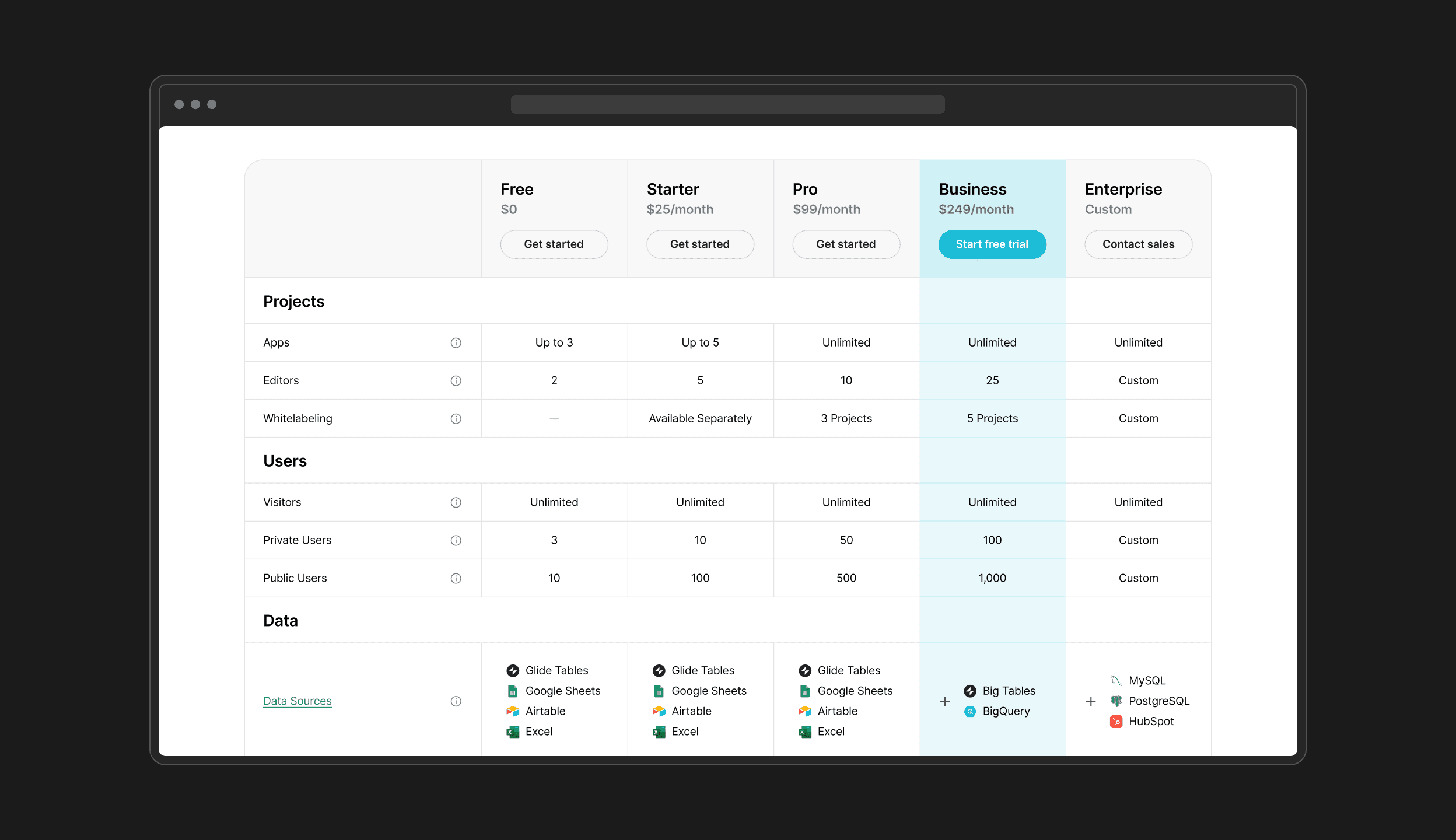
The new plan comparison section organizes features into a table instead of alternating rows and uses more consistent spacing to increase readability for each item. The addition of the Enterprise plan provides customers with a comprehensive view of Glide’s offerings at every price point.
The new plan comparison section organizes features into a table instead of alternating rows and uses more consistent spacing to increase readability for each item. The addition of the Enterprise plan provides customers with a comprehensive view of Glide’s offerings at every price point.


Leveraging product ratings to build trust and credibility
Leveraging product ratings to build trust and credibility
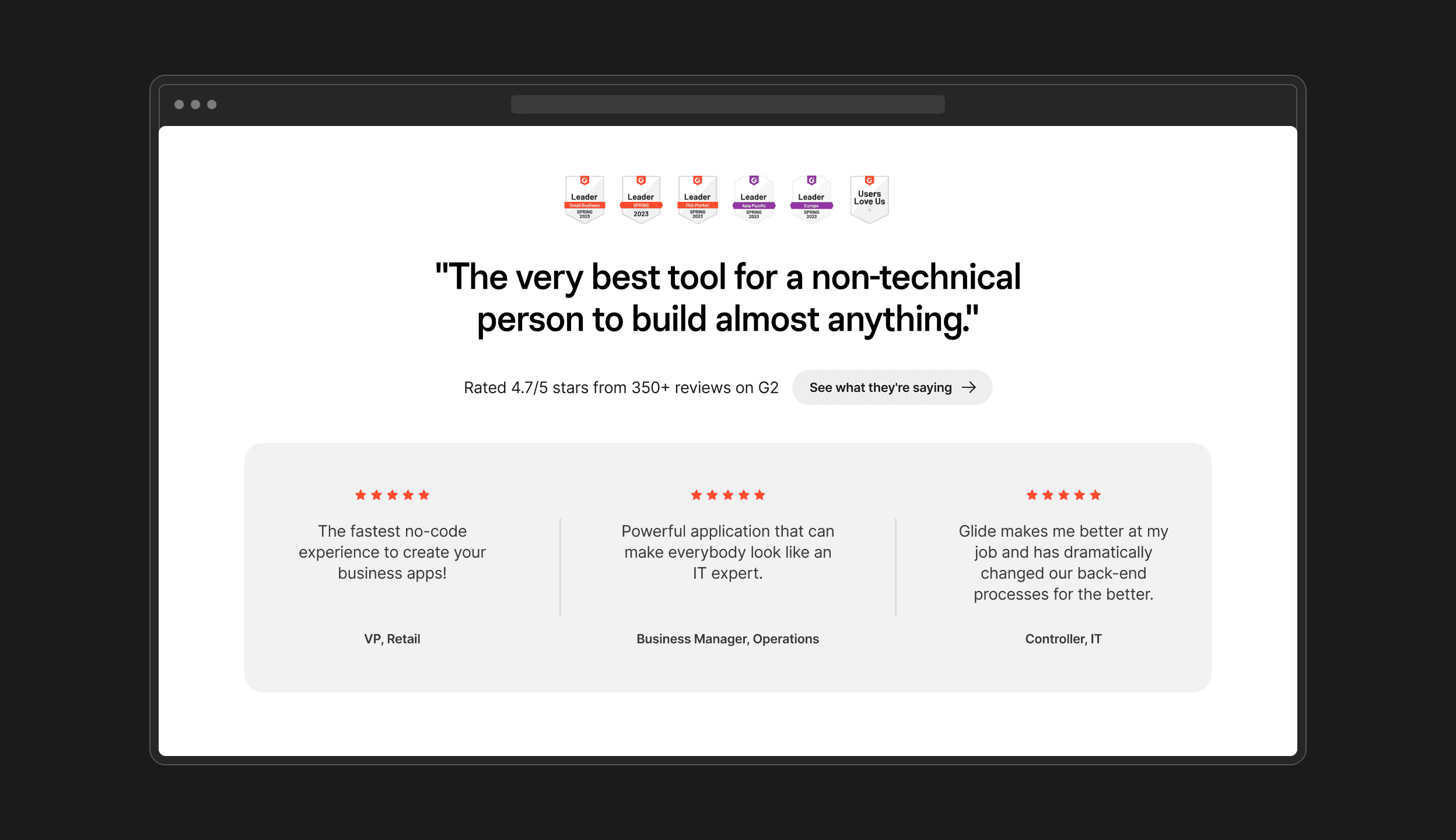
The addition of G2 ratings, badges, and targeted testimonials provides compelling social proof from trusted third-party sources. By highlighting diverse customer perspectives and roles, the section helps customers better envision how Glide could benefit their specific needs.
The addition of G2 ratings, badges, and targeted testimonials provides compelling social proof from trusted third-party sources. By highlighting diverse customer perspectives and roles, the section helps customers better envision how Glide could benefit their specific needs.


Crafting a responsive design optimized for mobile
Crafting a responsive design optimized for mobile
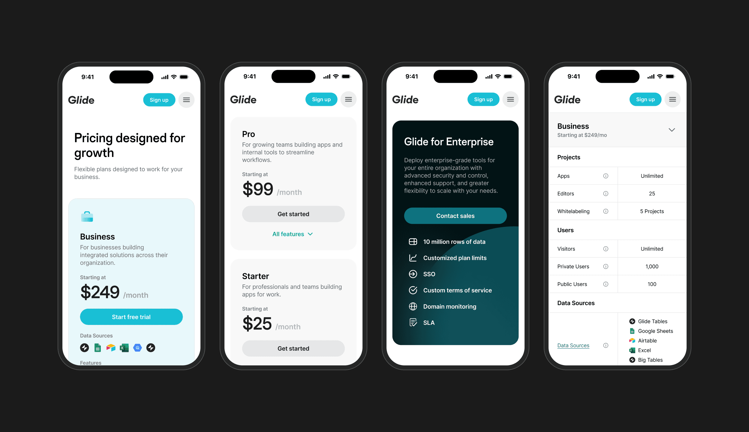
We found that the majority of visitors to Glide’s marketing site traffic came from mobile users, so we prioritized a responsive design that clearly communicates Glide’s pricing plans across all screen sizes.
We found that the majority of visitors to Glide’s marketing site traffic came from mobile users, so we prioritized a responsive design that clearly communicates Glide’s pricing plans across all screen sizes.


Communicating Glide’s dynamic pricing model
Communicating Glide’s dynamic pricing model
While Glide’s pricing plans show flat monthly rates, the actual costs scale based on the amount of users that a customer’s apps have. I designed several explorations of an interactive pricing calculator to visualize this scaling cost structure, which helped inform the pricing calculator currently in production.
While Glide’s pricing plans show flat monthly rates, the actual costs scale based on the amount of users that a customer’s apps have. I designed several explorations of an interactive pricing calculator to visualize this scaling cost structure, which helped inform the pricing calculator currently in production.
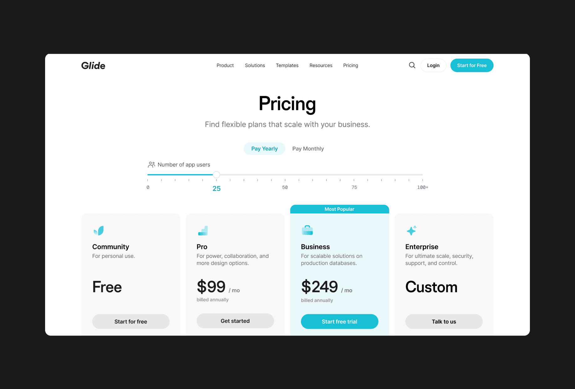


Global pricing slider
Global pricing slider
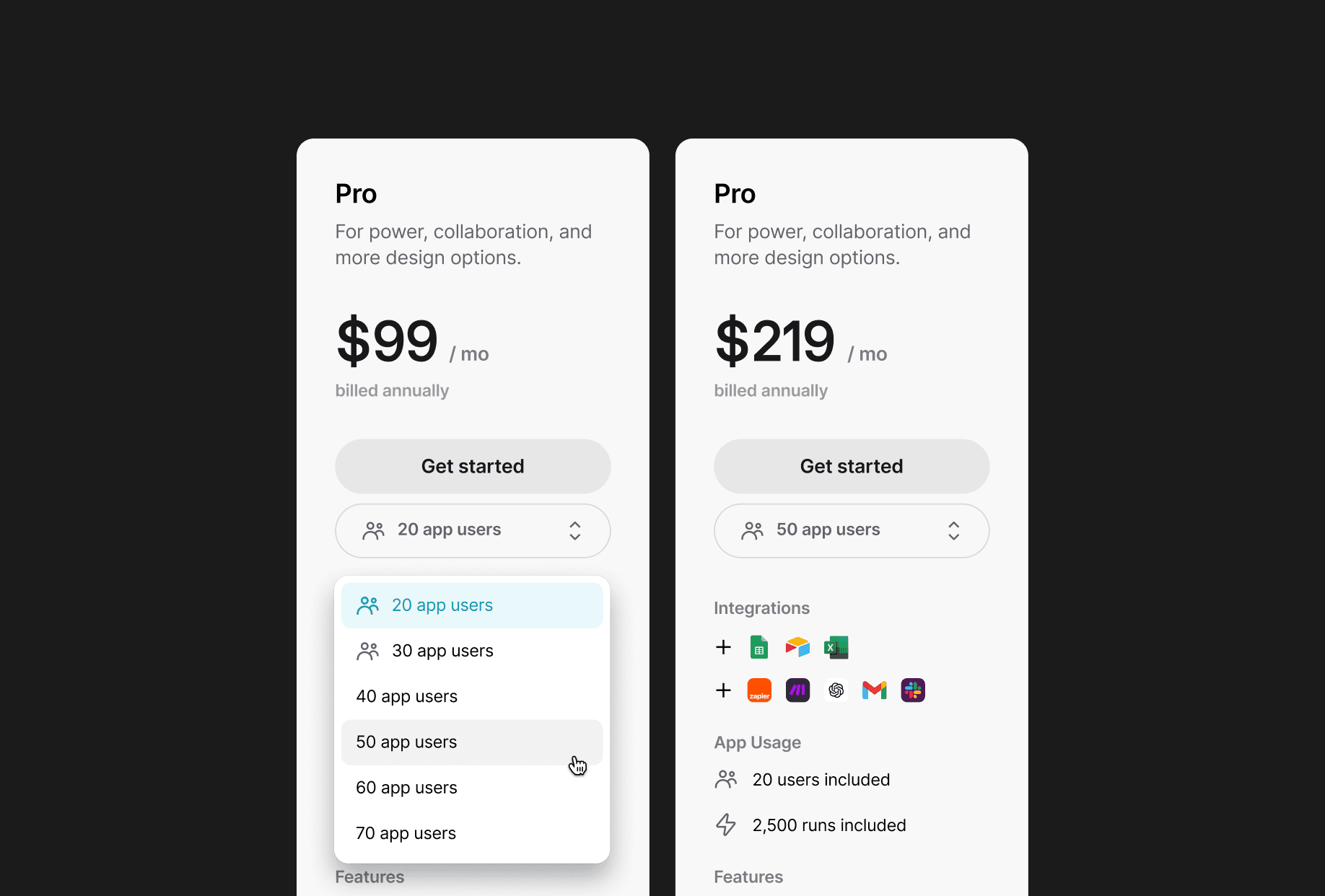


Per-plan dropdown
Per-plan dropdown
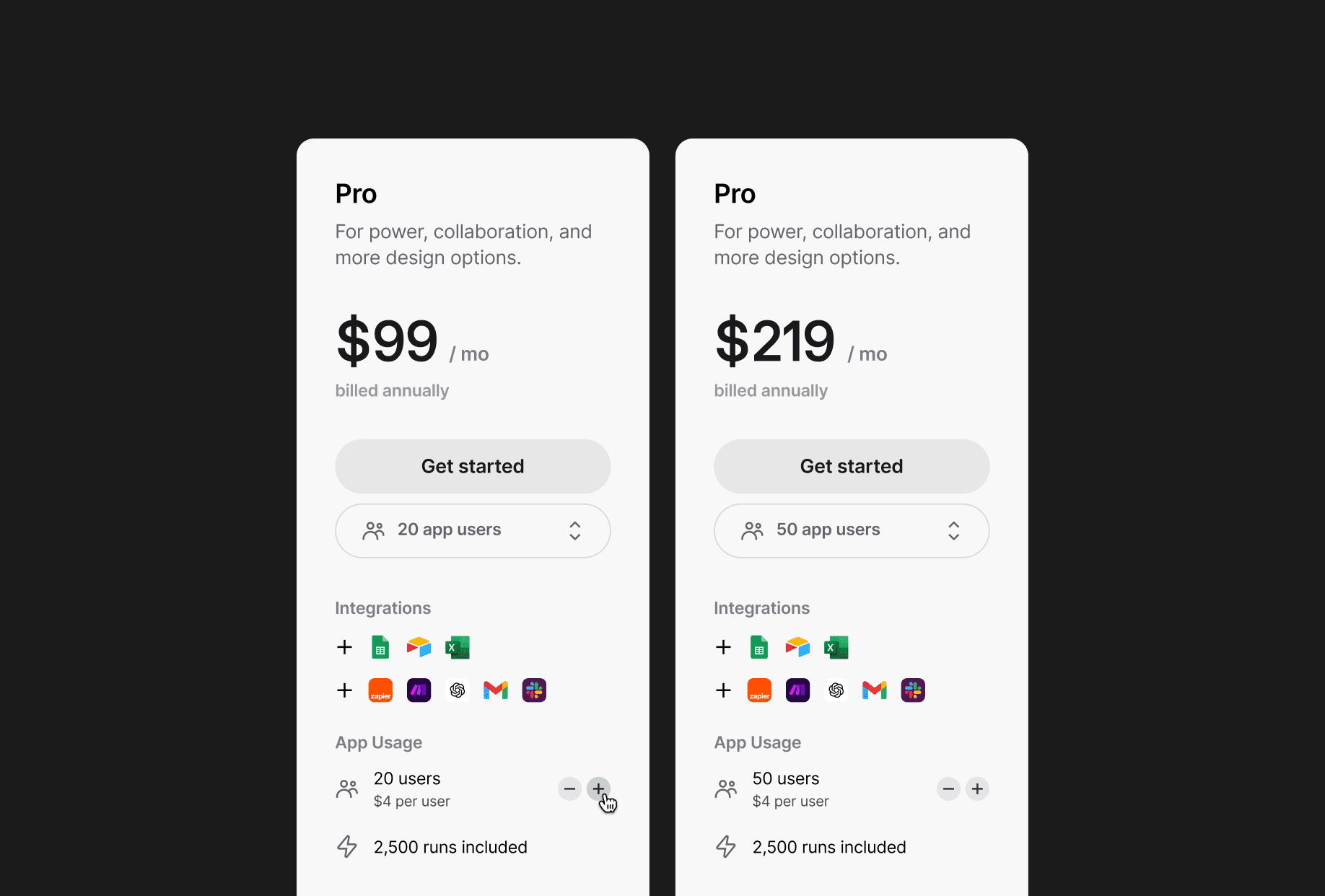


Per-plan incremental stepper
Per-plan incremental stepper
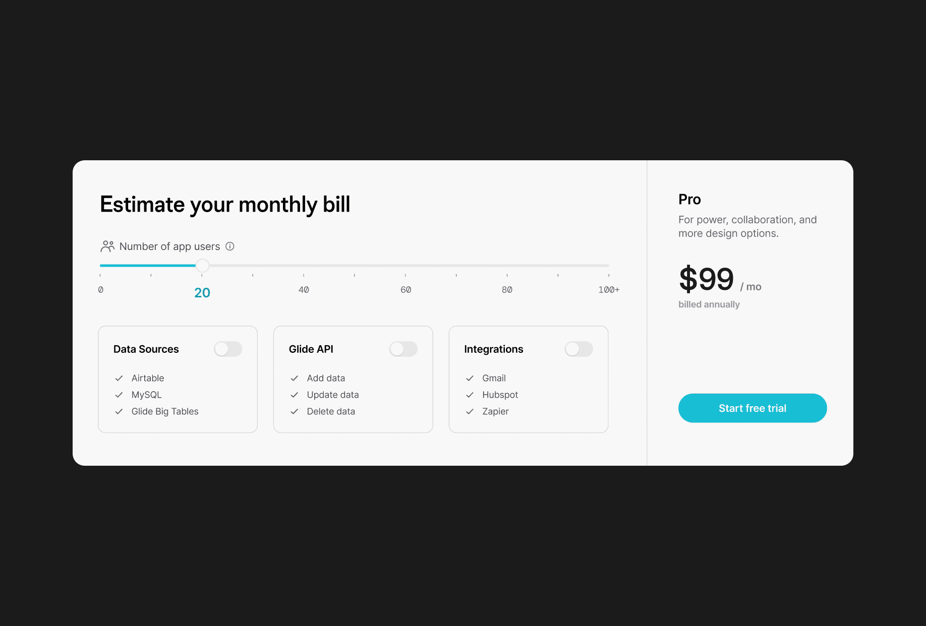


Interactive pricing calculator
Interactive pricing calculator
Final outcome
Final outcome
Final outcome
Presenting the revised pricing page
Presenting the revised pricing page


Retrospective
Retrospective
This experience gave me greater insight into how effective product design goes beyond user interface improvements—it requires understanding business objectives, technical constraints, and how design choices influence customer decision-making at every stage of the sales funnel. Here are my main takeaways:
This experience gave me greater insight into how effective product design goes beyond user interface improvements—it requires understanding business objectives, technical constraints, and how design choices influence customer decision-making at every stage of the sales funnel. Here are my main takeaways:
Balancing multiple stakeholders
Collaborating across sales, marketing, design, and engineering, I had to find solutions that balanced each stakeholders’ needs while still prioritizing user experience.
Shipped is better than perfect
Since Glide was updating their pricing structure across the product, it was more important to launch an initial redesign and iterate based on customer behavior rather than pursuing a “perfect” design.
Let's build something awesome together.
© 2025 Chase Goulet
Let's build something awesome together.
© 2025 Chase Goulet
Let's build something awesome together.
© 2025 Chase Goulet


